
What We Built Without Knowing We Were Building It
A Plain-Language Account of Human-AI Collaboration

For readers curious about working with AI — no technical background required.
How It Started
A colleague asked if I could put together a practical illustration for a machine learning workshop he was running. I spent three Saturdays preparing materials, then couldn’t present due to unforeseen events. Sitting with the unused work, I wondered: could I start entirely from scratch with an AI assistant and reach the same destination?
The answer turned out to be yes, and faster. But more interestingly, the destination I reached wasn’t quite the one I had originally prepared. It was better.
Before reading further, please note this is experimental and should not be basis for making investment or trading decision.
The first request to the AI was modest: take a folder of stock price data and help me identify fifty companies that broadly represent the five hundred largest US publicly listed companies. No plan. No clear picture of where this was going.
What followed illustrates something I’ve come to think of as the defining characteristic of working with an AI collaborator: the destination becomes visible only as you walk toward it. That first request about fifty stocks was, without either of us knowing it at the time, the opening move of a project that would eventually produce a system trained on sixty years of financial history and capable of outputting a daily reading about the state of the market.
This is an account of how that happened, and what it felt like from the practitioner’s side.
Teaching a System What Normal Looks Like
Before anything could be built, there was a more fundamental question: what should the system pay attention to?
A stock price on its own tells you almost nothing useful about the broader character of the market, what practitioners call the market regime. A 2% move in a single day means something very different in 2013, a calm, rising market, than it does in March 2020, when the same move might happen before lunch and reverse by close. The raw number is meaningless without context.
What we needed was a way to describe the texture of the market on any given day, not just price levels, but the quality of movement. How volatile has this stock been lately? Is the whole market moving in lockstep (a sign of fear-driven trading) or are individual stocks behaving independently (a sign of normal conditions)? Is this stock acting like itself today, or has something changed?
We assembled thirty-six such measurements for each of the fifty stocks, updated daily. The result was something like a daily health report for the market, not a single number, but thirty-six dimensions of information that together describe whether conditions are normal or unusual.
One of those measurements deserves a brief mention because it captures the idea well. We calculated, for each stock, how unusual its behaviour was relative to its own recent history. A stock that normally moves 0.5% per day but is suddenly moving 3% is drawing attention to itself. This self-referential check, is this stock acting like itself? — turned out to be one of the more sensitive early-warning signals.
The Central Idea: Learn Normal, Then Flag Deviations
The core design choice was this: don’t try to predict what the market will do. Instead, learn what normal looks like, and measure how far today departs from it.
This approach has a compelling property for financial markets: you don’t need to define in advance what a crisis looks like. The system is never told “this was the 2008 financial crisis” or “this was a normal trading week.” It learns purely from the structure of the data itself, what patterns appear regularly, what combinations of measurements characterise ordinary market conditions.
The analogy I find useful is a doctor who has seen thousands of healthy patients. They develop an intuition for what normal looks like, normal blood pressure, normal gait, normal reflexes, that is difficult to articulate as a set of rules. When something is wrong, they often sense it before they can name it. The system works similarly: exposed to decades of market data, it builds an internal sense of what normal market conditions look like. When today’s conditions diverge significantly from that, it struggles — and that struggle is the signal.
Concretely: the system compresses each day’s thirty-six measurements down to a thirty-two-number summary, a kind of fingerprint of current market conditions. It then tries to reconstruct the original thirty-six numbers from that compressed fingerprint. Under normal conditions, it does this well. Under unusual conditions, the reconstruction is poor, and the error is large. A large reconstruction error means the system has encountered something it cannot explain using what it learned from normal markets.
The system was taught using market data from 1962 to 2017, a period spanning the dot-com bubble, Black Monday, the 2008 Global Financial Crisis, and the quiet bull market of 2013-2017. It had to learn through all of it to develop a genuine sense of what normal means across a wide range of conditions.
The Bug That Announced Itself Quietly
The teaching process appeared to go well. The charts showing the system’s progress looked right. Everything seemed fine.
It wasn’t.
Part of the teaching process involved a mechanism that was supposed to gradually slow the system’s adjustment speed as it got closer to a good solution. Think of it like a car decelerating as it approaches a destination: making large adjustments early, smaller and smaller ones as you get closer, to avoid overshooting. The mechanism was supposed to watch for progress to plateau, then reduce the adjustment speed.
The problem was that progress never quite plateaued. The system was finding tiny, fractional improvements on every single cycle, not because it was genuinely learning something new each time, but because the adjustment mechanism was always finding some marginal gain. The deceleration trigger never fired. The adjustment speed stayed at its initial fast rate for all 150 cycles.
The fix was to replace the conditional mechanism with an unconditional one: instead of waiting to detect a plateau, simply reduce the adjustment speed on a smooth, predetermined curve throughout the entire process. No conditions. Guaranteed deceleration from cycle one.
This episode matters because it illustrates something important about building with AI: problems in complex learning systems often don’t announce themselves as errors. Everything runs. Progress happens. The charts look plausible. The only sign that something is wrong is that one carefully monitored value, in this case, the adjustment speed, printed at each cycle, never changes. You have to know what to look for.
The AI could implement the fix quickly once the problem was identified. Finding the problem required a practitioner paying close attention to things that weren’t obviously broken.
Getting the Alarm Right: Three Attempts
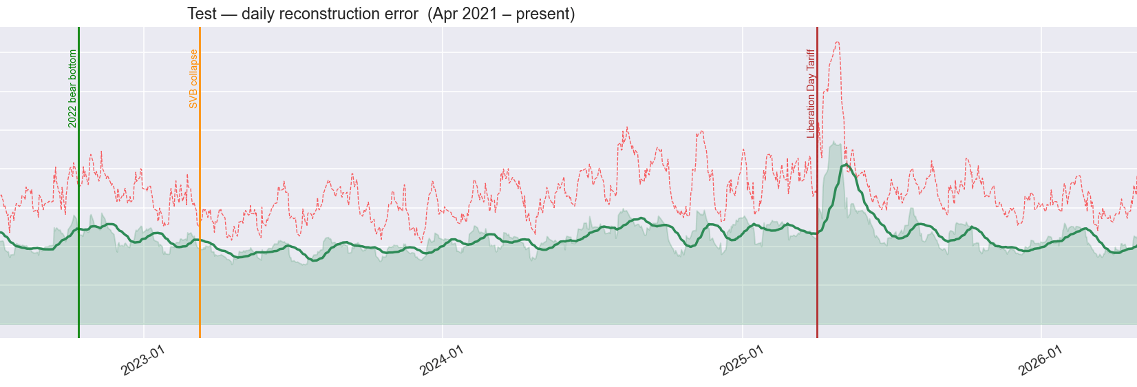
The system produces a number every day: how hard did it find today’s market to reconstruct? The practical question is: at what level does that number constitute an alarm?
Getting this calibration right took three attempts. Each failure was instructive.
First attempt: the wrong type of number. The initial alarm threshold was set by looking at the raw daily error values from a recent checking period (a separate block of market history kept aside to test whether the system was learning real patterns, not just memorising the data it was taught on). Applied to more recent data, the alarm never fired. Not once.
The problem was a subtle category mismatch. The threshold had been set against the raw, day-to-day error values, which are noisy and volatile. But the signal being tested was a three-week rolling average of those errors , much smoother and calmer. Comparing a threshold built for noisy raw values against a smoothed average is a bit like setting a speed camera for 100 mph and pointing it at the average speed of cars over an hour-long journey. The average will never trigger it.
Second attempt: the wrong period. The fix was to match the threshold to the same smoothed signal, but the checking period used as the reference included the COVID crash of 2020, which turned out to be the most extreme event in the entire dataset. Setting the threshold against COVID implicitly says: nothing counts as a crisis unless it is at least as severe as a global pandemic. The prolonged market decline of 2022, the bank collapse of March 2023, the tariff shock of April 2025, all genuine market disruptions — were not extreme enough to clear that bar.
Third attempt: the right reference. The correct approach was to use the full fifty-five-year teaching period as the reference, which includes Black Monday (1987), the dot-com collapse (2000-2002), and the Global Financial Crisis (2008). These define what “historically unusual” actually means. Against that backdrop, two alarm levels emerged: an amber warning zone and a red crisis zone.
With this calibration, the results became economically sensible. The 2022 market decline registered as sustained amber, which is exactly what it was, a gradual, anticipated decline driven by rising interest rates rather than a sudden shock. The April 2025 tariff disruption registered as red, a sharp, broad, and sustained disruption that the system had never seen at that combination of scale and breadth.
The lesson: the choice of reference period is a substantive decision. It encodes a view about what counts as normal.
Sixty Years of Memory
One of the more important presentation decisions was to chart the system’s daily reading all the way back to 1970, he full period it was taught on, rather than only the recent years.
When you see the signal only for 2018-2025, it is hard to interpret. Is a particular spike large or small relative to history? When you see it against sixty years, each event finds its place. The Oil Embargo of 1973. The Federal Reserve raising interest rates to 20% in 1979 to break runaway inflation. Black Monday in October 1987. The Russian government debt default in 1998.
The system had to develop its sense of normal across all of these. Seeing them annotated on the chart, crash dates and recovery dates marked with vertical lines, makes the daily reading interpretable in a way no shorter window can.
One annotation was added in real time: the Liberation Day Tariff announcement of April 2025. By the time recent market data reached that point in the analysis, the system was flagging it as one of the most anomalous episodes in the entire sixty-year record.
What the System Found About Crashes
One of the most striking findings was unplanned. It emerged from asking a simple question: what were the ten worst days in each period of the dataset?
The answer was consistent across all three periods, and it contradicted the intuitive expectation.
The system’s worst days are not the crash days. They are the days that come after.
The worst days in the historical teaching period were not October 19, 1987 , the day of Black Monday, but the three weeks following it. Not September 15, 2008, the day Lehman Brothers collapsed, but the peak of the chaos that followed. In the checking period, the worst days were not February 19, 2020, when markets first began to fall on COVID news, but a thirteen-day stretch in March and April: record unemployment claims, emergency central bank interventions, violent daily reversals, and maximum uncertainty. In the most recent period, all ten worst days fell in April and May 2025, not on the day of the tariff announcement itself, but in the weeks after.
The pattern makes sense once you see it. A single-day crash produces a large reading on one or two of the system’s thirty-six measurements: how much the market moved, and how volatile it has been. The aftermath is harder to handle: it produces simultaneous extremes across many measurements at once, volatility, cross-market correlation, trading volumes, momentum signals, and more, all held at unusual levels for days or weeks together. That combination is genuinely outside the range of experience in a way a single crash day is not.
The crash is the event. The aftermath is the regime change. The system finds the weeks after a crisis harder to explain than the crisis itself, because the aftermath looks like nothing it was taught was normal.
From Experiment to Working System
At some point in the project, the question shifted from “does this work?” to “how would someone actually use it?”
That question required restructuring. Exploratory work happens in interactive workspaces where you run one piece at a time, inspect charts, and adjust on the fly. A working system needs something more disciplined: a fixed sequence of automated steps that runs the same way every time, produces the same outputs, and can be re-run six months later without needing to remember what you did.
The restructuring separated the work into clear layers: a data-processing stage that takes raw stock prices and converts them into the thirty-six daily measurements; the system itself; and a daily scoring step that runs every evening and produces a fresh reading.
One design choice worth naming: all the settings that control the system, how far back to look, where the alarm thresholds sit, live in a single shared settings document. Change one number there, re-run everything, and every part of the system inherits the updated value automatically. This matters in practice: adjusting the system for different conditions, or extending the historical data forward by a year, is a matter of editing one file.
The daily scoring step produces a colour-coded output: normal, amber, or red, and writes a small output file that other tools (a risk dashboard, an automated alert, a position-sizing system) can read directly.
Making Sure It Still Works
Once the system was restructured into separate components, a new problem appeared: how do you know it still works after you change something?
The answer was a set of 208 automated checks that run in seconds and report immediately if anything has broken. Writing them turned up two problems worth describing, because both illustrate something general about complex systems.
The first was a check that appeared to pass while doing nothing useful. One part of the system acts as a switchboard; it receives a command and routes it to the appropriate process. To test the switchboard, we replaced the real process with a harmless stand-in that simply records whether it was called. The problem was that by the time the substitution was made, the switchboard had already been wired up to the original process at startup. The stand-in was in place in name, but the switchboard still pointed to the real thing. The check appeared to pass, but it was actually running the full real system, processing all fifty stocks, taking five minutes. Everything looked fine. Nothing was fine.
The fix required understanding exactly when the wiring happens internally, and replacing the connection at the right moment rather than just the name. This is a narrow trap, but once you have seen it, it is easy to spot and easy to fix.
The second required constructing unusual situations deliberately. One component has two safety paths: what to do when there is not enough historical data yet, and what to do when today’s data has a gap. Neither situation arises naturally with clean, complete data, so to test them, we had to build artificial datasets that forced each condition. This required precise reasoning about what internal conditions trigger each path. The reward was confirmation that the system handles both gracefully, which matters, because both occur regularly with real market data.
Reading the Map
With a trained system in hand, those thirty-two-number daily fingerprints contained a compressed record of sixty years of market behaviour. The question was how to read it.
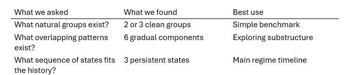
Three different approaches were applied in sequence, each asking a different question.
The first sorted all sixty years of fingerprints into groups, then asked whether the groups corresponded to different market conditions. The answer was clear: two or three groups, where one group consistently showed higher stress indicators — more volatility, sharper price declines, higher system error — than the others. Three groups proved most useful economically, separating a normal state, an elevated state, and a stress-like state.
The second used a more flexible approach that allowed overlapping groups with partial membership — a fingerprint could belong partly to one group and partly to another. The result was richer: six overlapping patterns rather than three clean groups. This is not a contradiction. When you allow the method to look for finer detail, it finds it. The correct reading is not “there are six market regimes” but “the fingerprint space has at least six distinguishable patterns, and market conditions often sit between them.”
The third incorporated time directly. Rather than asking “which group does today’s fingerprint belong to?”, it asked “given everything seen up to today, what sequence of hidden states best explains the full history?” This approach selected three states, validated by testing how well it predicted a period it had never seen during the learning phase. The three states had durations that matched economic intuition: roughly nine months in the normal state, three months in the elevated state, and two months in the stress state.
The synthesis that emerged was not three competing answers but three complementary perspectives:
What the AI Cannot Do
This is the part of the story that felt most revealing.
The AI built the analysis machinery competently. Given a specification, “evaluate these three approaches against known crisis periods and stress indicators”, it produced working code that ran the analysis and generated the outputs.
What it could not do was interpret those outputs.
One method for choosing the number of groups returned the answer: six. The code could not say whether that means “the market has six regimes” or “the underlying pattern of this data is best captured by six overlapping probability clouds.” Those are different claims. The first is a statement about economics. The second is a statement about statistical structure. Knowing which interpretation is appropriate required understanding what the method actually measures: knowledge that lived with the practitioner, not the system.
More broadly, the three-approach synthesis, use simple grouping as a benchmark, overlapping patterns for substructure, and the time-sequence approach as the main regime model, was not produced by the analysis. It was imposed on the analysis by the practitioner. The analysis produced numbers. The practitioner decided what the numbers meant and how they fitted together.
This felt like a clarifying moment. Throughout the project, there was a rough division of labour: the AI managed breadth, holding the full structure of the system in working memory, implementing across many files, catching inconsistencies, while the practitioner managed depth, deciding what mattered and what the results meant.
In the final analysis phase this became explicit. The practitioner ran the analysis independently, formed their own interpretation, and returned with conclusions already in hand. The AI’s role in that session was largely to receive the synthesis and incorporate it. The economic content, which approach was most useful, why the differing results were not contradictory, what the typical state durations implied about how markets actually behave, came entirely from domain knowledge the AI did not have.
This is probably the honest description of what the collaboration actually is: the AI handles the surface area of implementation; the practitioner handles the depth of interpretation. Both are necessary. Neither substitutes for the other.
On Working This Way
Reading this account in sequence might suggest a clean, logical progression. It was not. The adjustment-speed bug appeared after the teaching process was already complete. The alarm threshold was recalibrated three times. The sixty-year historical view was added only after a shorter chart made the signal uninterpretable. The worst-days finding came from asking a simple question: what were the actual dates?
None of this is unusual in complex knowledge work. What was unusual was the texture of iteration with an AI collaborator.
In ordinary work, changing direction carries a cost: re-explaining context, re-establishing shared understanding. With the AI, changing direction was cheap. “Actually, let’s try it this way instead” produced a working result quickly, with no loss of context about everything that had come before. The full history of the project , every measurement, every threshold, every decision , remained available at all times.
What this enabled was a faster, tighter feedback loop between observation and adjustment. “The 2022 market decline doesn’t cross the threshold” is an observation that takes seconds to make. Acting on it, recalibrating the threshold, re-running the analysis, checking whether the result is now sensible, took minutes rather than hours. The cost of being wrong and needing to adjust was low enough that trying things, seeing what happened, and adjusting became the natural mode of working.
The project began with a list of stock tickers in a spreadsheet and ended with a trained system, an automated processing sequence, a sixty-year historical analysis, calibrated alarm thresholds, 208 automated checks, and a three-approach analysis of the system’s internal regime map. None of that was in the original brief.
The brief was fifty stocks and three columns. The rest emerged from the combination of a practitioner who knew what questions to ask and a collaborator that could hold the context, implement the answers, and iterate without friction. Neither party knew where it was going until they got there together.
What It Is Not Yet
The system as described produces a real daily reading. It has been tested against sixty years of market history. It correctly identifies the COVID crash as a crisis, the 2022 market decline as sustained stress, and the April 2025 tariff aftermath as the most extreme episode in the recent record.
What it is not yet is connected to live data. It currently runs on a fixed historical archive. Connecting it to a daily data source, so that it updates automatically each evening and produces a current reading, is the remaining gap between “working on historical data” and “running in practice.”
There is also an unrealised capability worth naming: given today’s market fingerprint, the system could search the sixty-year archive for the closest historical matches and report which periods today most resembles. “Current conditions most resemble mid-2011 and late 2002” is more actionable than any single number. The underlying infrastructure for this is already in place. The capability is not yet built.
Closing
There is something worth noting about the sessions themselves.
We began with a spreadsheet. We ended with a working system and a documented analysis of how markets move through regimes, including a reading of conditions through the April 2025 tariff shock.
But the thing that stays with me is not the output. It is how the collaboration changed over time. In the early sessions, the AI and I were building together in the straightforward sense: I described what I wanted, it implemented, I reviewed, we adjusted. In the later sessions, something shifted: I ran the analysis independently, formed my own interpretation, and came back with conclusions. The AI’s role became to incorporate what I had found, not to help me find it.
That shift from co-construction to expert-with-instrument, may be the general pattern. Early on, the AI is necessary to build what the practitioner imagines. Later, the practitioner is necessary to interpret what the AI has built. The most interesting part of the collaboration may be the boundary between those two phases, where the instrument becomes capable enough that the practitioner can work with it independently, and the practitioner becomes fluent enough that they know what to look for.
That is probably not unique to this project. But this project made it visible.
Notebook and code can be downloaded from here https://github.com/Oyetade/regime_detector
Written as a reflection on an extended series of working sessions over a period of two days